

About
Transamerica has two retirement journey management mobile apps: one app places a focus on Wealth and Health℠* but lacks the functionality the users need (more recent); the other app meets the users’ needs but does not embrace the Wealth and Health℠ philosophy (legacy).
We needed to merge the two mobile apps into one. We had to rethink the architecture, interaction flow, and visual design while keeping inline with the Transamerica philosophy.
For a more in-depth look, check out the full project details.
*Wealth and Health℠ is the main tenet in the Transamerica philosophy: protecting your Health can pay dividends in the future. Wealth and Health℠ focuses on a more holistic approach to retirement journey management, one that’s also focused on physical and mental wellbeing.
My role
UX designer, UI designer
Company
Transamerica
Category
Mobile app
Focuses
New design, redesign, IA
The design challenge
How could we design a mobile app that embodies the Wealth and Health℠ philosophy and provide key retirement journey management functionality? How could we create a space that could engage the users beyond the simple task of checking account balances? How could we add, improve, or augment 21 features in a design deliverable timeline of six months?
One of our biggest design challenges was working within those constraints and minimizing any new patterns or styles; we had to stick with what was in the more recent app and build on that. We had a small yet very effective team of three designers and one researcher.
Our initial discovery phase shed light on key issues we needed to address:
The user base of the more recent app was upset about the lack of financial tools that were available in the legacy app.
The users of the more recent app were confused: Why was Transamerica requiring users to answer Health questions when they just wanted to check their account status? What does Health have to do with Wealth?
The user base of the more recent app reverted to the legacy app as that offered more functionality, even though the experience and visuals were outdated.


The process
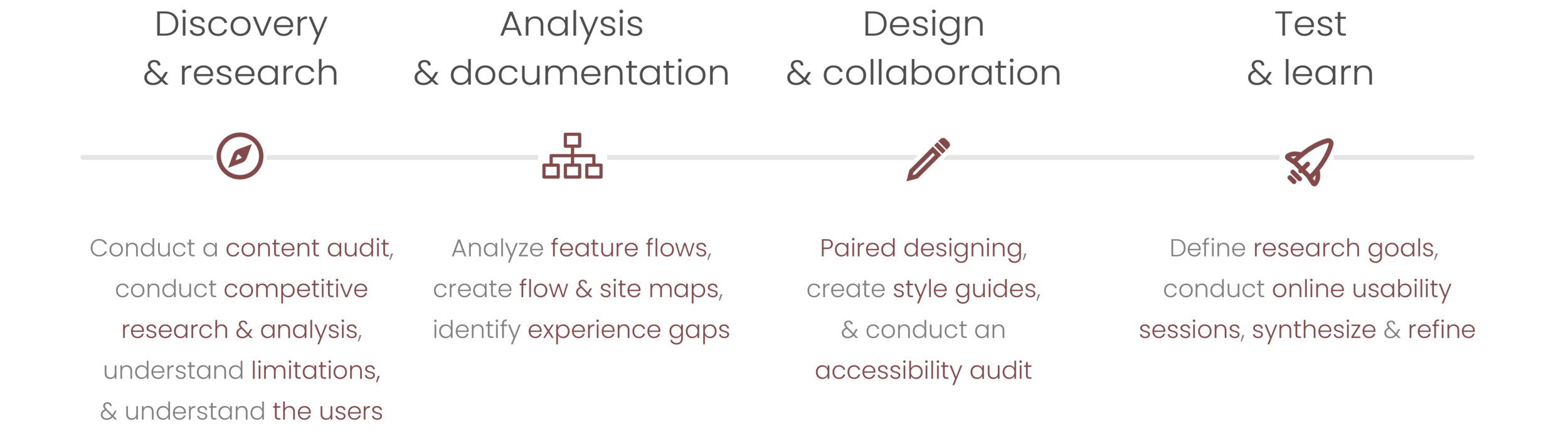
Test & learn
Our team conducted usability testing on the most complex features. We created three robust, clickable prototypes and synthesized the findings as a group.
A big thing we learned from our research was that retirement in general is confusing. Users need more guidance than what we were giving them. Our team then created a strategy to address some of the key findings that would keep us on target to hit our deliverable date.
*Note: Although we had a good idea of what needed to be improved, to meet our date we were not able to address all findings.

Feedback synthesis happened in real-time by using the Miro tool

Ideation for providing more guidance
Final product
We completed all feature designs in the provided timeline of six months. In order to make the design-developer handoff seamless, we created style guides to ensure our design vision could be easily understood and to set a foundation for the next releases. The Transamerica Retirement App was released in December, 2020.
For a more in-depth look, check out the full project details.


For a more in-depth look, check out the full project details.